 ← Back
The Royal Flavors
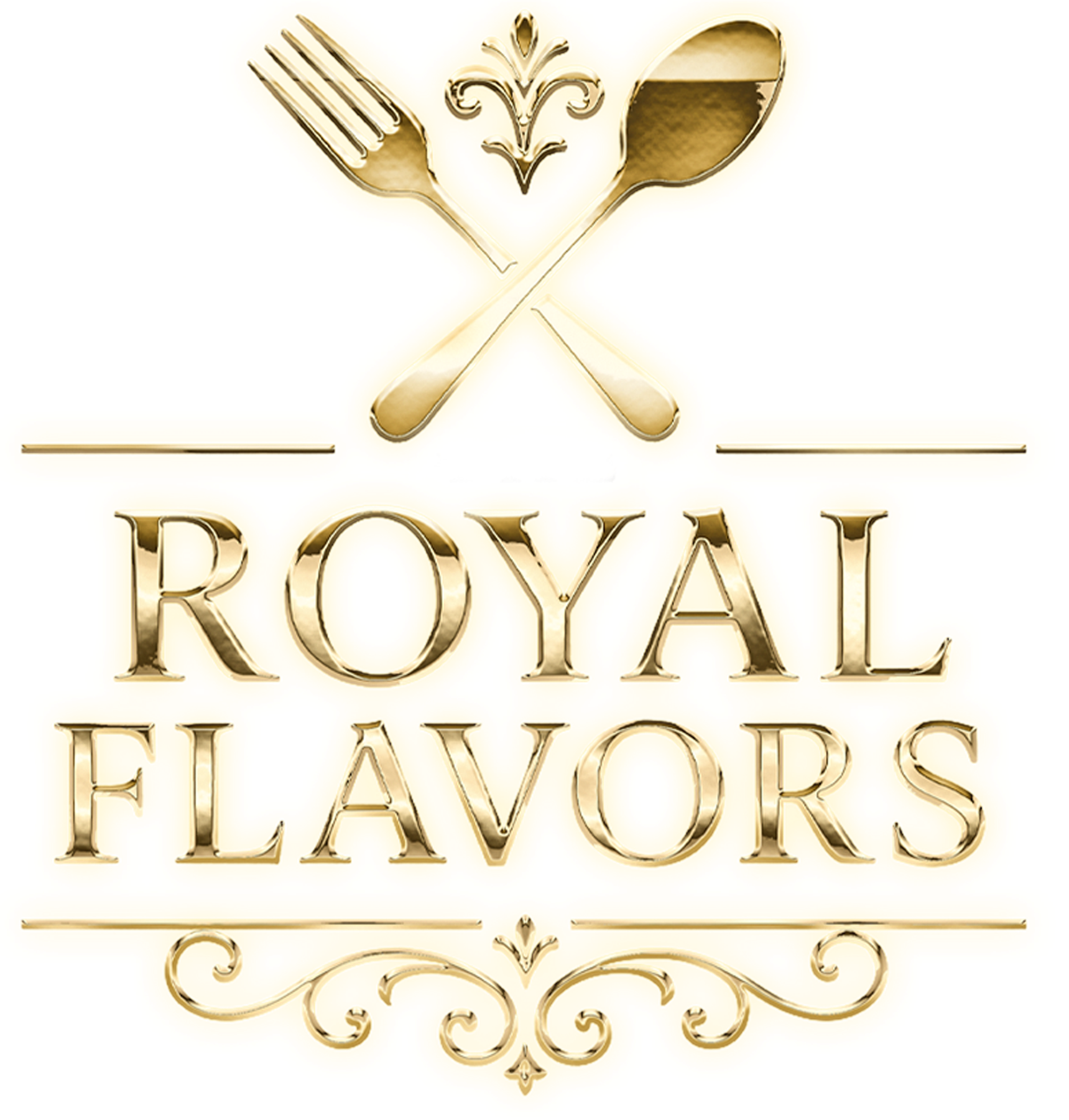
Crossed fork and spoon under a thin gold rule. A restrained lockup for a series that needed to read as formal without turning cold, delivered with the poster set and the episode artwork.
project →
Identity
The mark
The word royal does the work, so the mark is drawn to be worth looking at closely and still legible when it is not — the ornament is in the letterforms rather than around them, which means nothing has to be stripped out for the small sizes.
Key art
The sheet
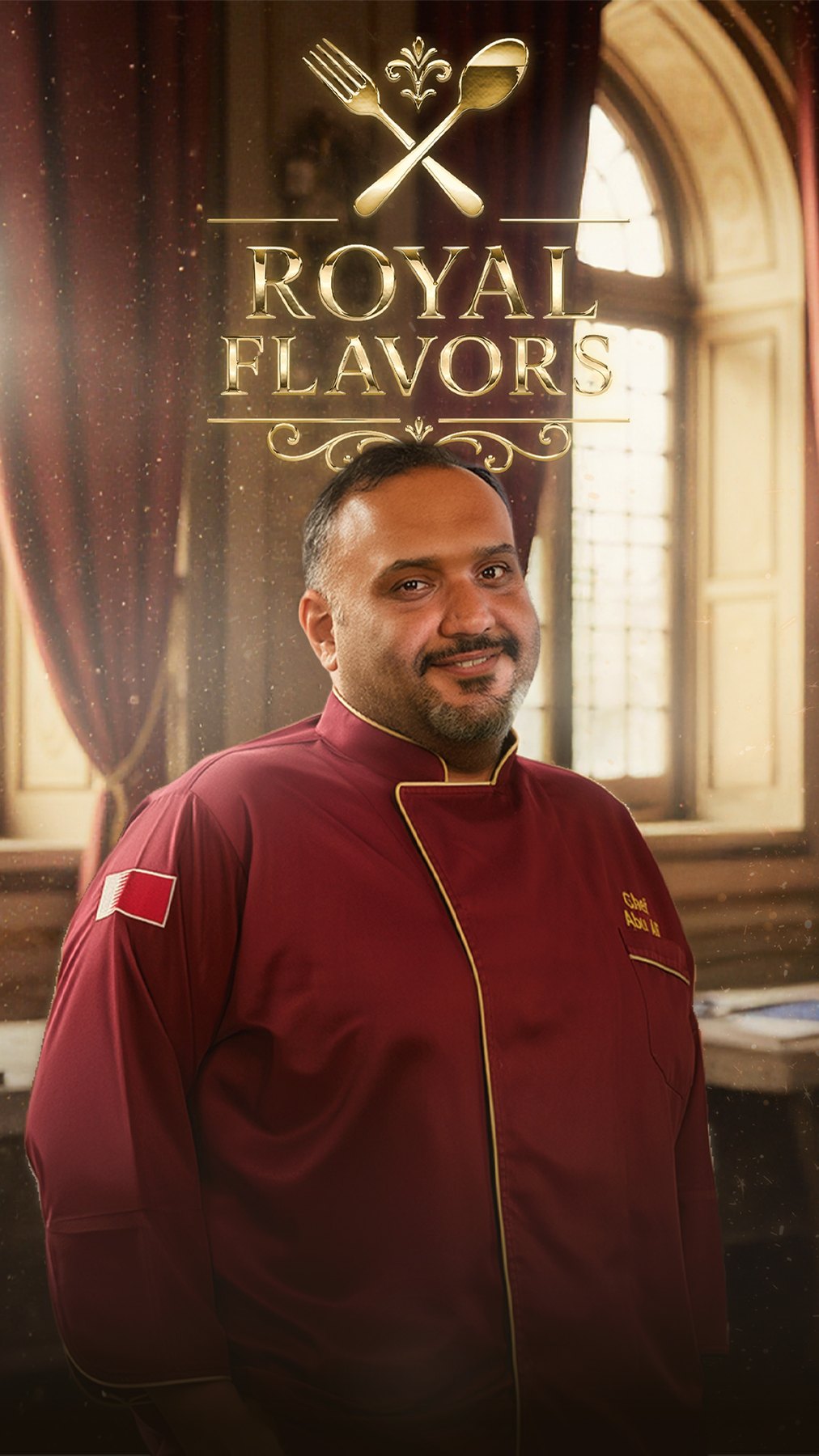
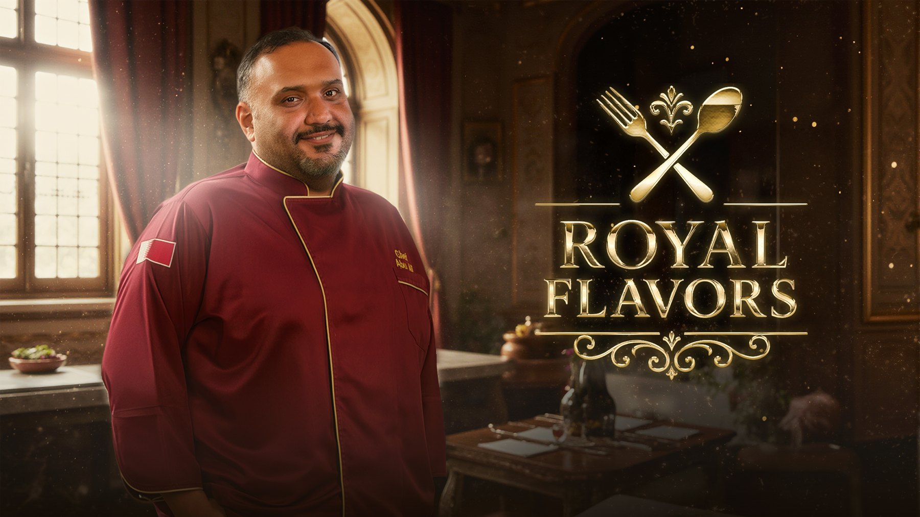
The poster set, delivered wide and tall. The wide one is the key art the channel runs; the tall one is the sheet everything else is cut from.