 ← Back
Master or Disaster
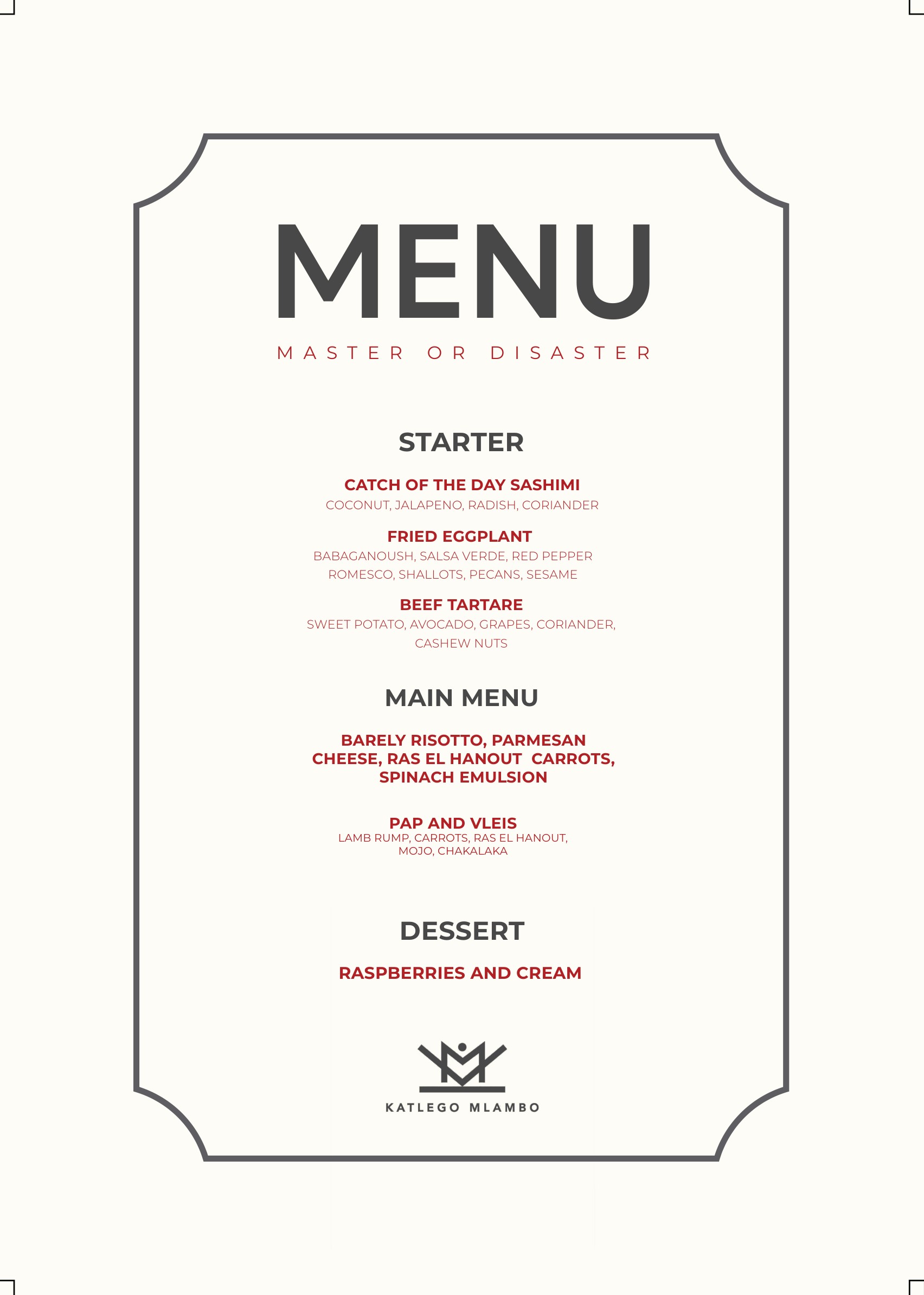
A cooking competition that had to look like a heist. The identity came first — the neon mark that sits on the back wall of the studio — then the poster set, then the décor itself. The artwork ships as a full kit: broadcast sizes, social crops, chef cards, the on-screen menu and the split screens the edit cuts to.
project →
Logo
Concept & Design Thinking
The identity of Master or Disaster was built around the main question behind every challenge: will the chef master the situation, or will it turn into a disaster?
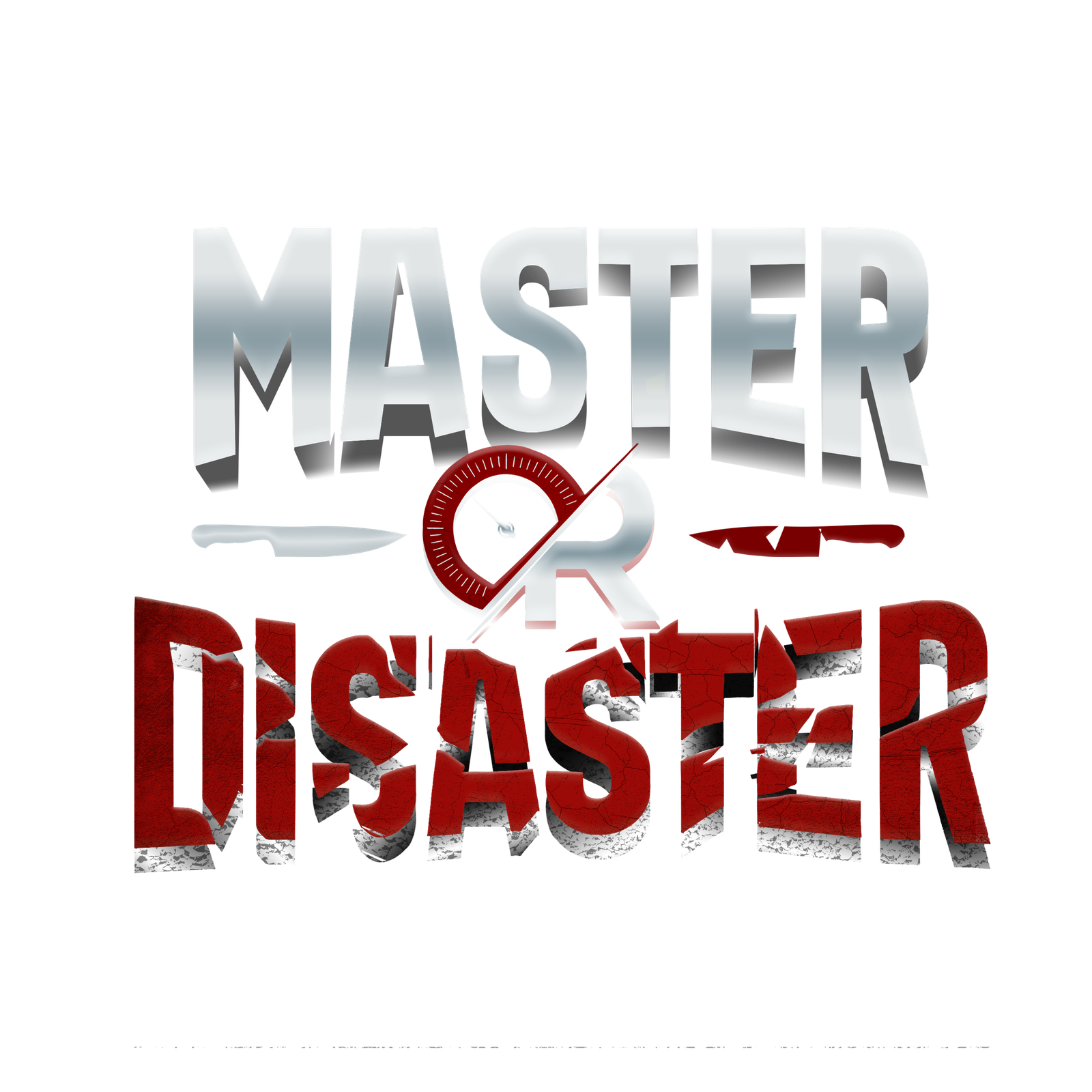
I translated this contrast directly into the typography. “MASTER” is bold, clean and structured, representing control, precision and successful execution. In contrast, “DISASTER” is fragmented, distressed and visually unstable, representing mistakes, pressure and chaos.
Posters
Visual Concept & Design Thinking
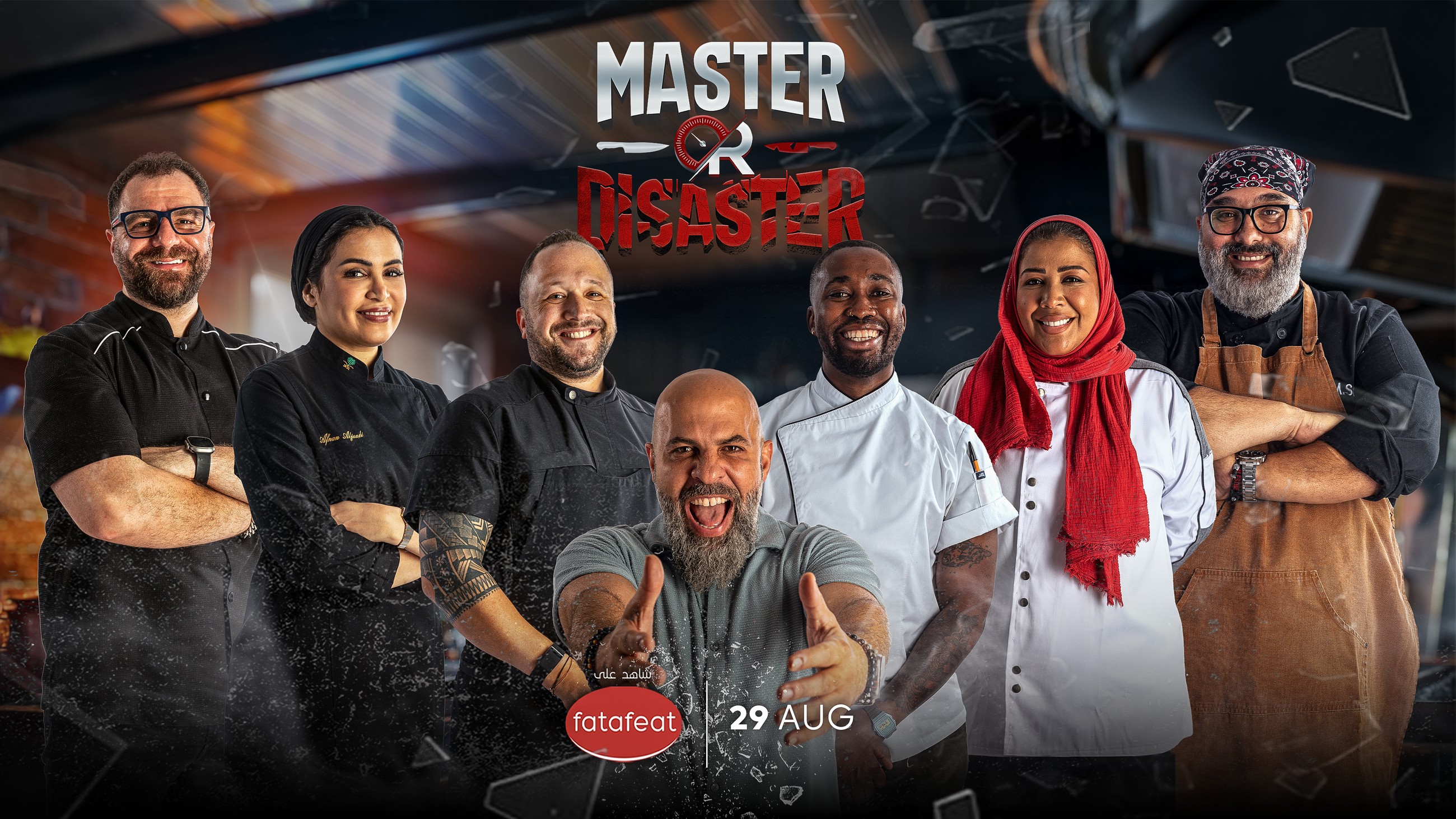
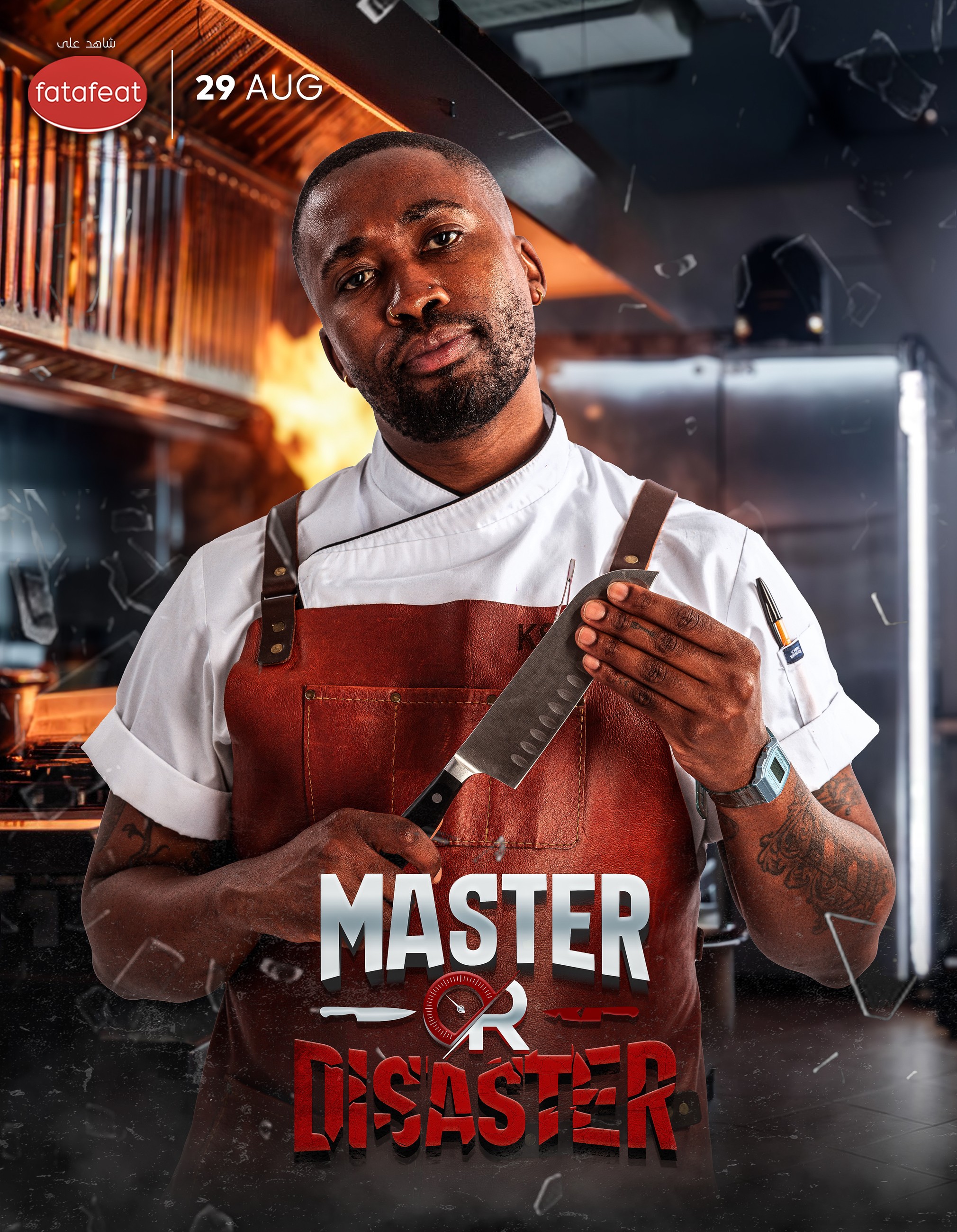
For the poster campaign, I wanted to move away from the traditional polished image of a cooking show and present the kitchen as a competitive arena.
The visual direction therefore focuses on pressure, movement and confrontation. Dramatic kitchen lighting, motion, particles and flying elements create the feeling that something is constantly happening around the chefs, reflecting the limited time and unpredictable nature of the competition.
I developed two main poster formats with different purposes. The main cast poster introduces the complete world of the show and its chefs, with the host positioned as the central visual anchor. The composition brings everyone together while maintaining the intense atmosphere established by the identity.
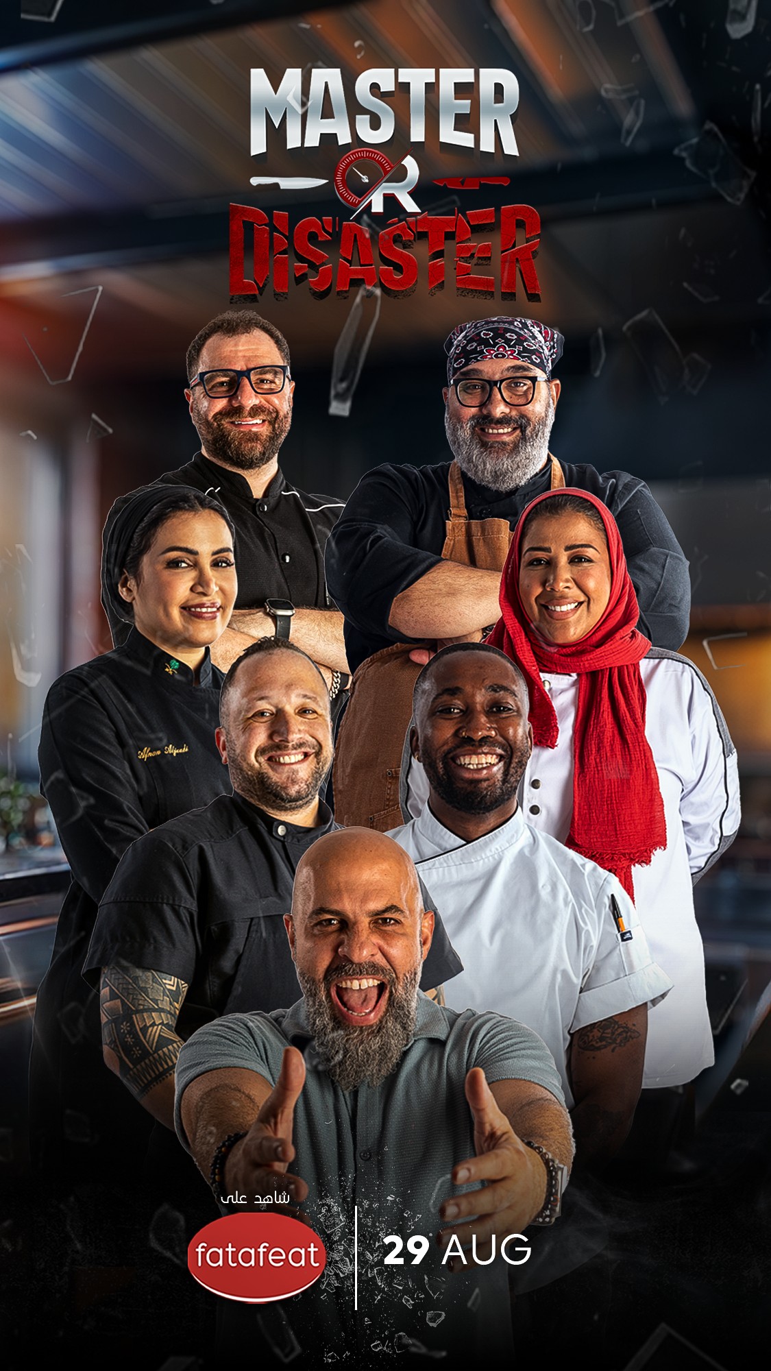
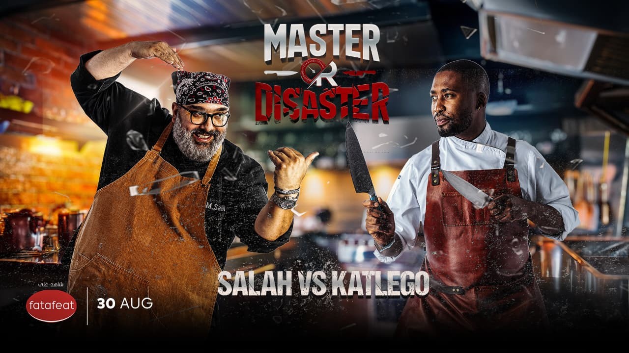
The episode posters are designed differently because each episode is ultimately a confrontation between two chefs. I placed the competitors on opposing sides of the composition to create a clear face-off, using their poses and expressions to give every matchup its own personality and energy.
The Master or Disaster logo remains between and above the competitors, almost acting as the question hanging over the entire challenge: after the pressure, the time limit and the exchange of menus, which outcome will they reach — Master or Disaster?
Set Design
From Competition to Fine Dining
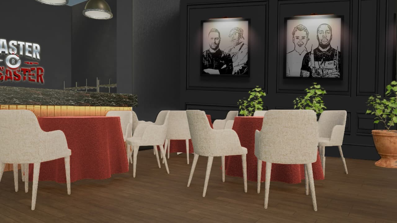
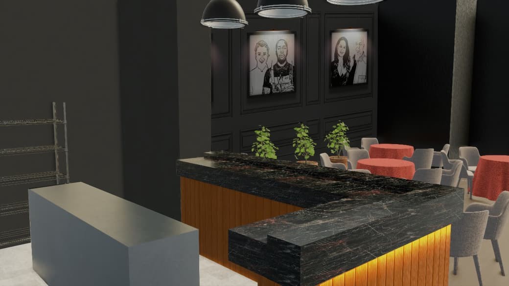
The set was designed as a hybrid environment that combines a professional competition kitchen with a fine-dining restaurant experience.
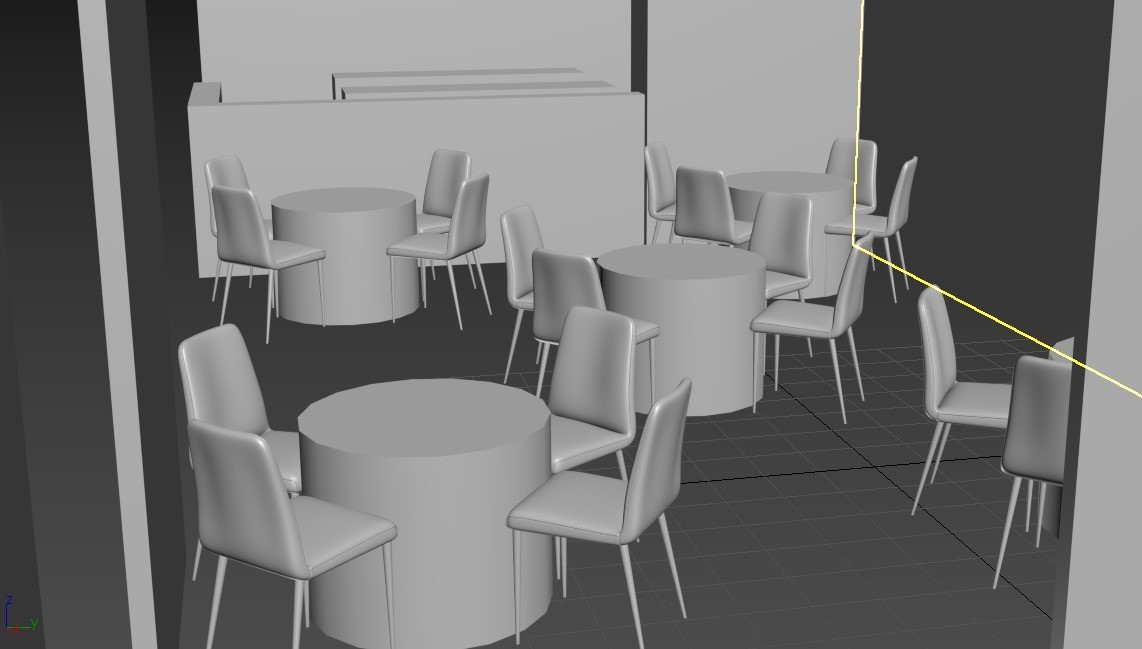
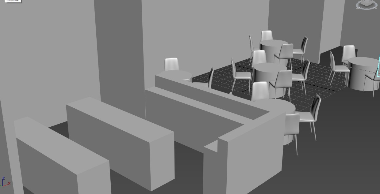
Since the format of Master or Disaster changes throughout the challenge, the space needed to support both sides of the experience. The layout was therefore divided into two connected zones: an active competition kitchen, where the chefs and their teams work under time pressure, and a fine-dining area, where guests later enter and experience the final dishes.
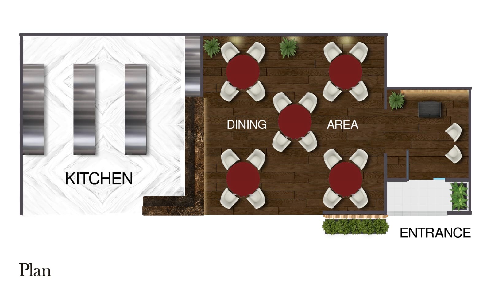
Rather than completely separating the two spaces, I designed them as parts of the same environment. This allowed the energy of the competition to remain visually connected to the refined dining experience.
Visual Language
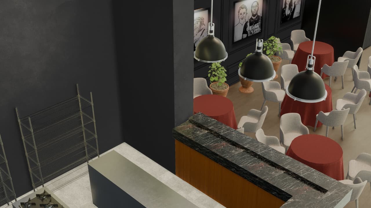
I carried the visual identity of the show into the physical environment through a dark, dramatic palette combined with red accents, warm wood, black surfaces and controlled lighting.
The dining area was intentionally designed with a more refined and intimate atmosphere to reflect the fine-dining concept, while still belonging to the same visual world as the competition. Red table treatments connect the space to the show’s identity, while warm wood, upholstered seating and focused lighting create a more sophisticated dining atmosphere.
Portraits of the competing chefs were integrated into the wall design, making the chefs themselves part of the environment and reinforcing the competitive character of the show.
Translating the Identity into Space
One of my main goals was to make the graphic identity feel physically embedded in the set rather than simply placing a logo on a wall.
The Master or Disaster logo was transformed into a large dimensional, backlit feature that acts as one of the main visual landmarks of the set. Against the dark environment, the warm backlighting gives the identity a strong presence both within the space and on camera.
This created one continuous visual language across branding, promotional design and scenography — taking the project from a graphic identity and poster campaign into a fully realized physical environment.


Photoshoot
Art Direction
The poster concept was planned before the photoshoot, allowing me to define the poses and body language needed from each chef based on the final compositions I had in mind.
For the episode posters, I directed the chefs into specific poses that would create a stronger sense of competition and confrontation once placed together in the final artwork. The group poster required a different approach, with individual poses planned to give each chef their own character while still working as one unified composition.
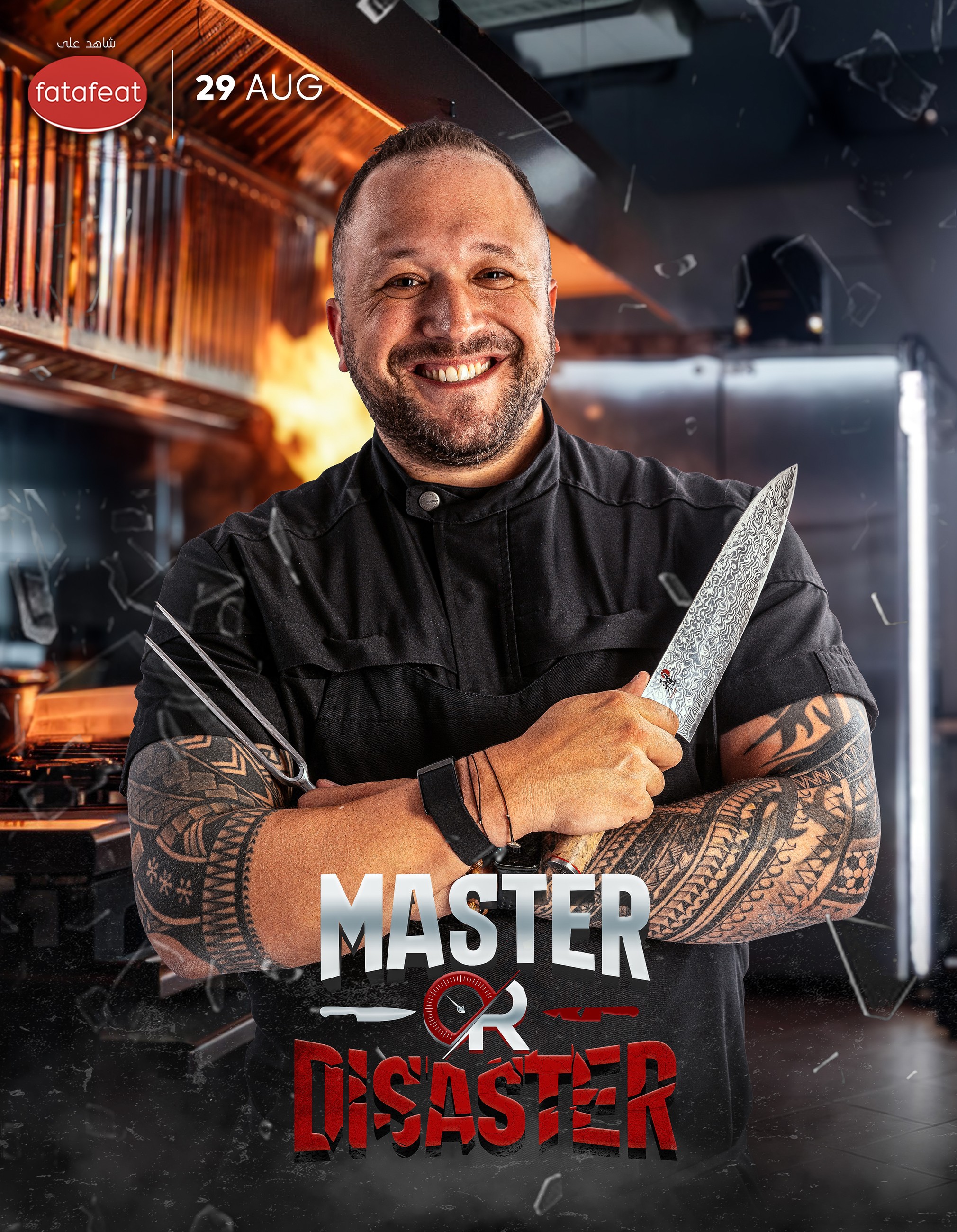
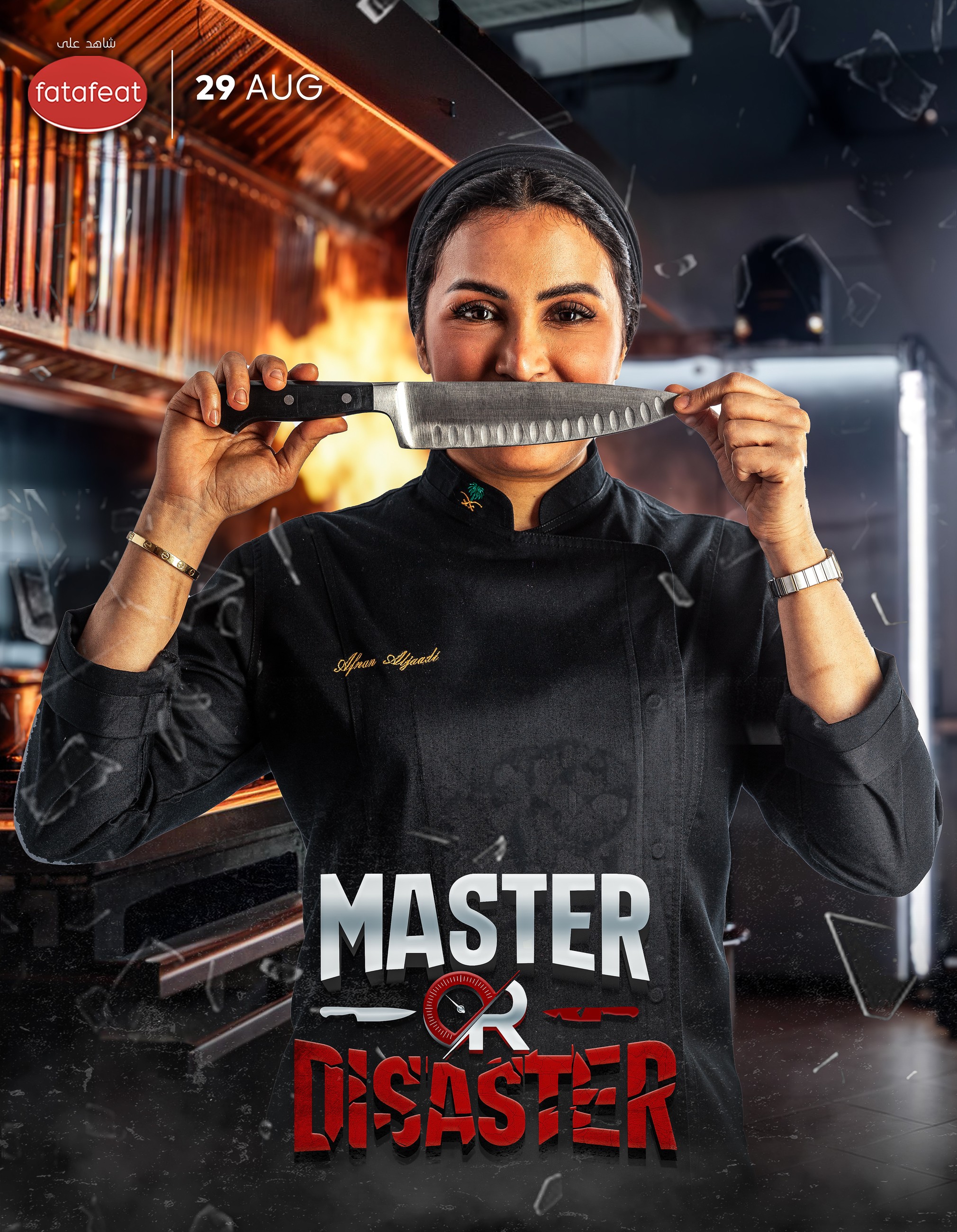
By planning the poses around the poster layouts from the beginning, the photographed elements could be integrated naturally into the final designs rather than forcing the composition around existing images.


Master or Disaster
Show Concept
Master or Disaster is a competitive cooking show built around pressure, adaptability and the challenge of stepping into another chef’s world.
In every episode, two chefs compete against each other, each supported by their own team. Before the challenge begins, both chefs create their own menus — but instead of cooking their own dishes, the menus are exchanged.
Each chef is then given only two hours to understand, prepare and execute the other chef’s menu with their team, forcing them to work outside their usual approach while racing against the clock.
As the challenge progresses, the experience transforms from a cooking competition into a fine-dining service. Guests enter the restaurant and, during the final stage of the challenge, the chefs must complete their dishes and prepare them for service.
The format creates a constant contrast between control and chaos, preparation and improvisation, Master and Disaster — where the chefs are not only tested on how well they can cook, but on how successfully they can adapt under pressure.
Visual Identity · Logo Design · Poster Design · Photoshoot Art Direction · Set Design · 3D Visualization