 ← Back
Split Kitchen
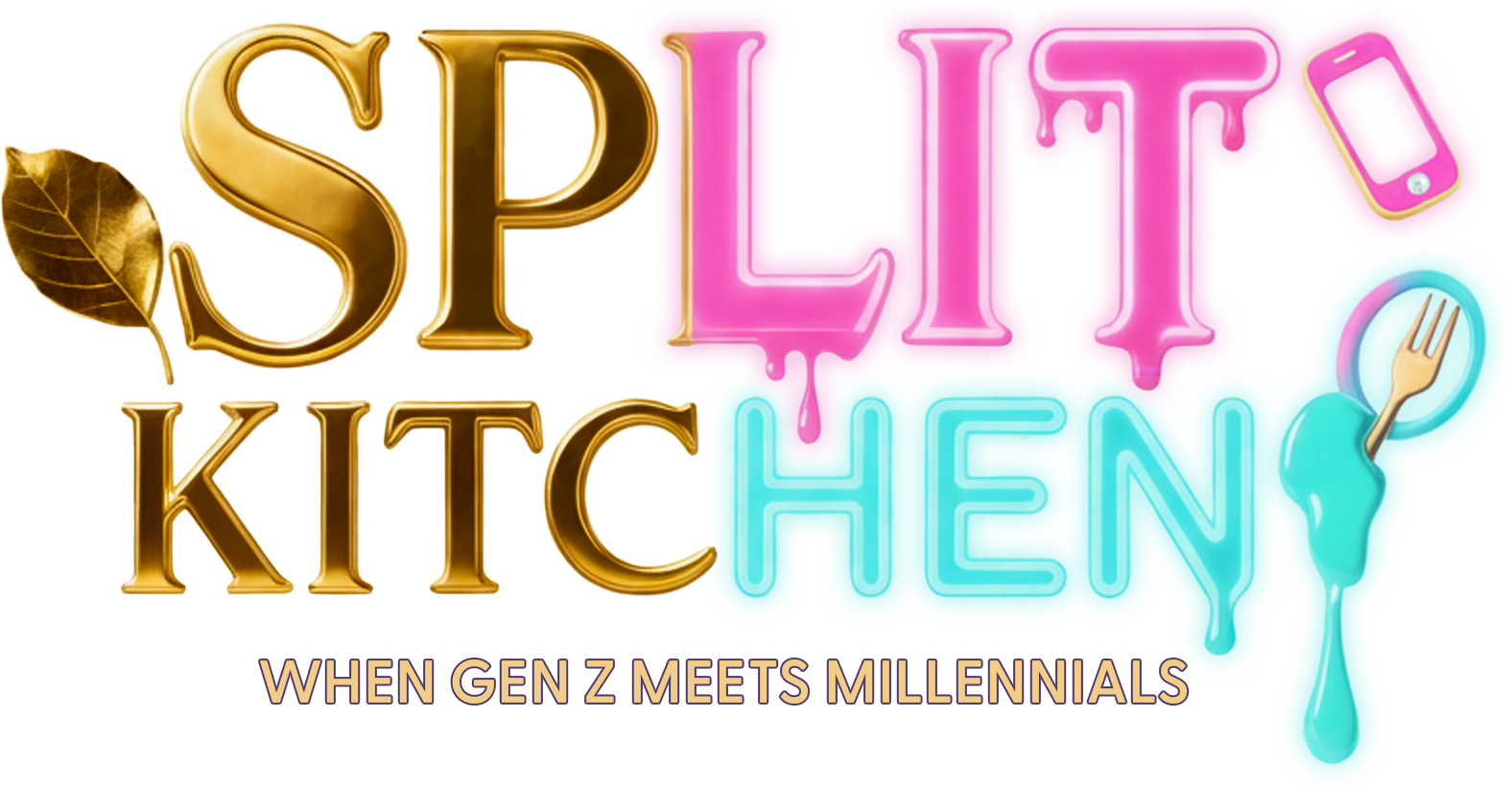
Two generations, one kitchen, and a logo that had to look like both at once — gold serif against neon, each half belonging to a different decade. The line sits in the mark itself rather than under it.
project →
Identity
The mark
Two generations cooking against each other, so the mark is split down its own middle and the two halves are set differently. It is one word doing two things, which is the whole premise of the show in the one place everybody sees it.
Key art
The sheet
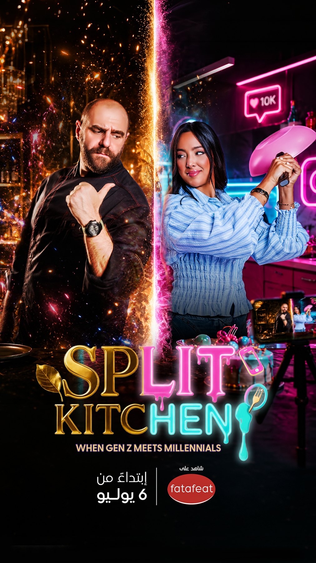
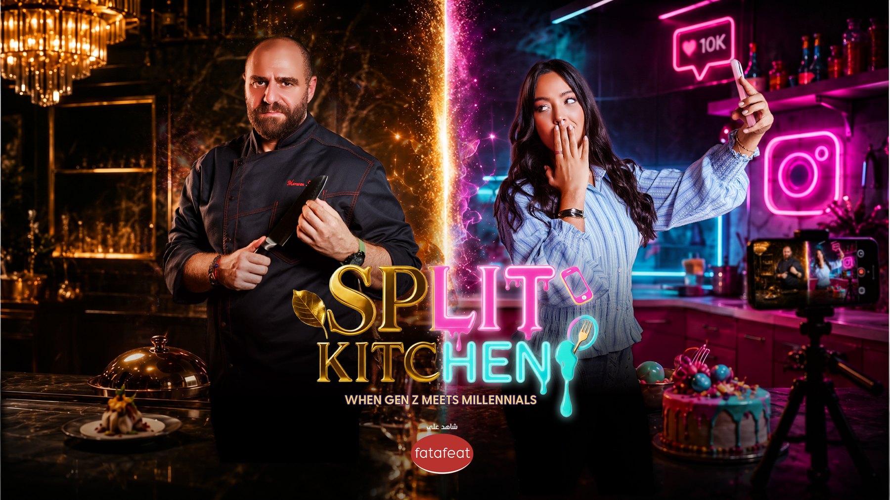
The poster keeps the split running through the picture and not just the type — the divide is the composition, and each side is lit and dressed to belong to the cook standing in it.