Scenographer and designer from the Faculty of Fine Arts, Capital University. I design the look of a show from the logo outwards: the set it is filmed on, the poster it is sold with, and the cut that goes to air.
Chapter III
Logos and lockups that survive a channel bug.
Logo designKey artSet design
Master or Disaster
A cooking competition that had to look like a heist. The identity came first — the neon mark that sits on the back wall of the studio — then the poster set, then the décor itself. The artwork ships as a full kit: broadcast sizes, social crops, chef cards, the on-screen menu and the split screens the edit cuts to.
Logo designKey artSet design
Escape Kitchen
A kitchen you have to escape from. Corridors that go nowhere, a dining room lit by one chandelier, and an owl watching the players — built practical so the cameras could move through it. The vintage lockup and the poster set were cut for every delivery the channel needed, OSN's sheets included.
Logo designKey artOutdoor
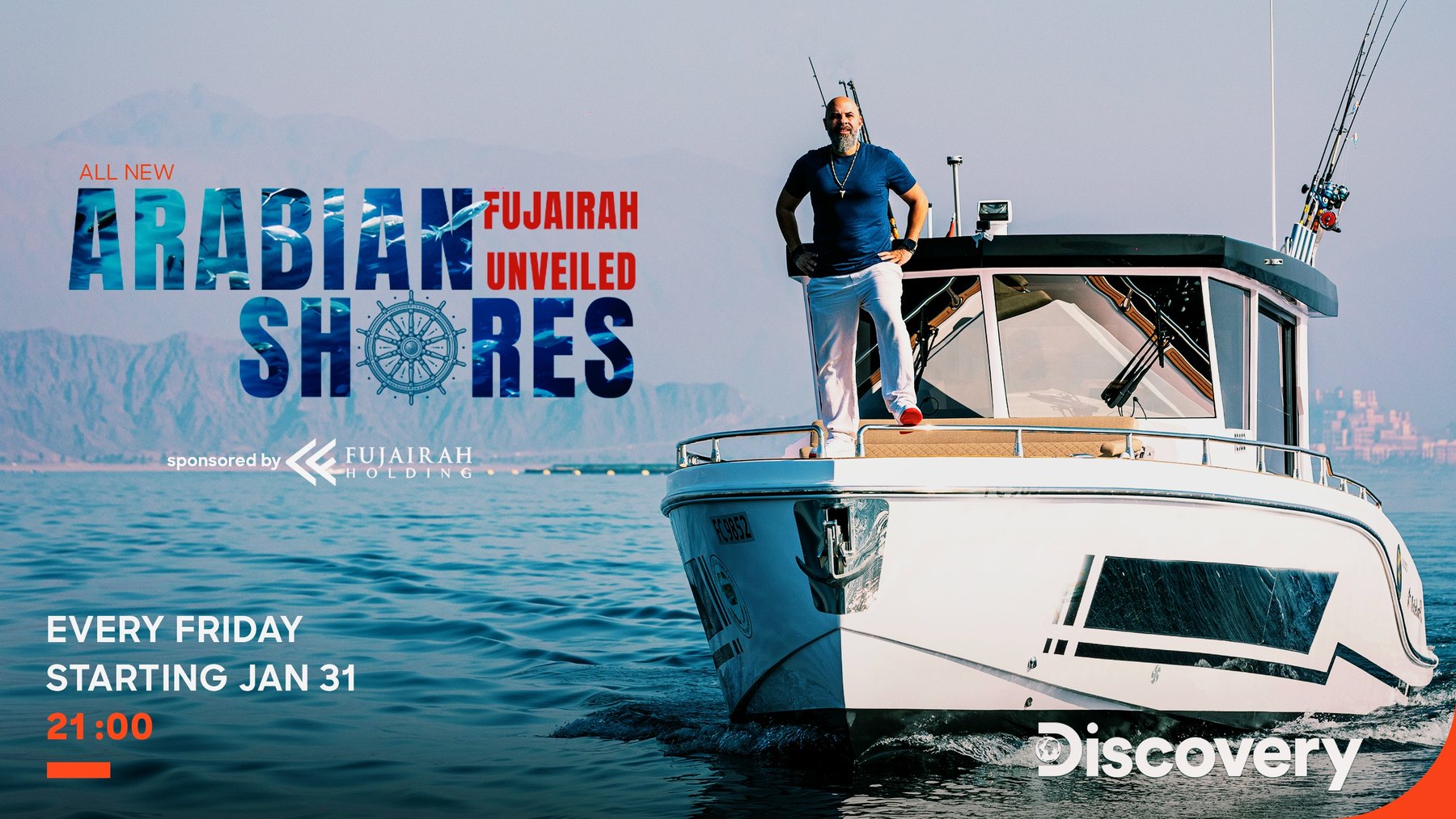
Arabian Shores
The sea cut into the letters. A travel series across Fujairah, with a wordmark filled by its own footage, a poster set for broadcast and social, and the billboard and lamppost sheets that carried it outdoors.
Logo designKey art
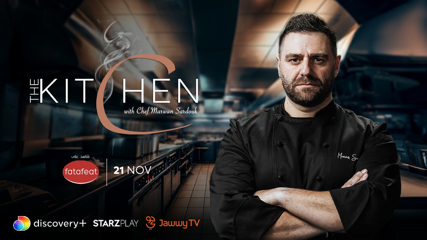
The Kitchen
A chef, a kitchen, and a mark that had to hold both. The lockup was drawn in black and white so it could sit on any frame the show cut to, and the key art was built out in a full poster set across broadcast, social and channel sizes.
Logo designKey artSeasonal campaigns
Hekayat Matbakh
Kitchen stories, retold every season. One Arabic wordmark carried through Ramadan, a Khaleeji season, a back-to-school run and a street-food run — each with its own key art, its own palette, and the full set of broadcast and social sizes. The 2026 lockup is the mark redrawn in gold.
Logo designKey art
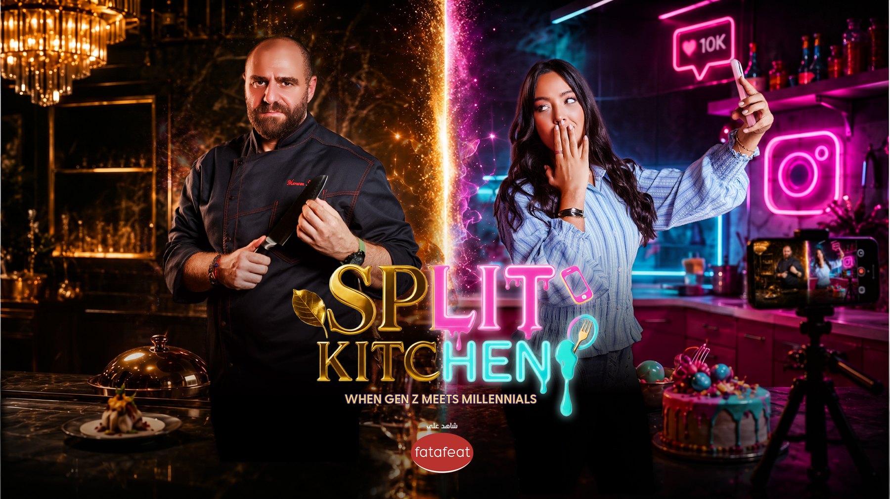
Split Kitchen
Two generations, one kitchen, and a logo that had to look like both at once — gold serif against neon, each half belonging to a different decade. The line sits in the mark itself rather than under it.
Logo designKey art
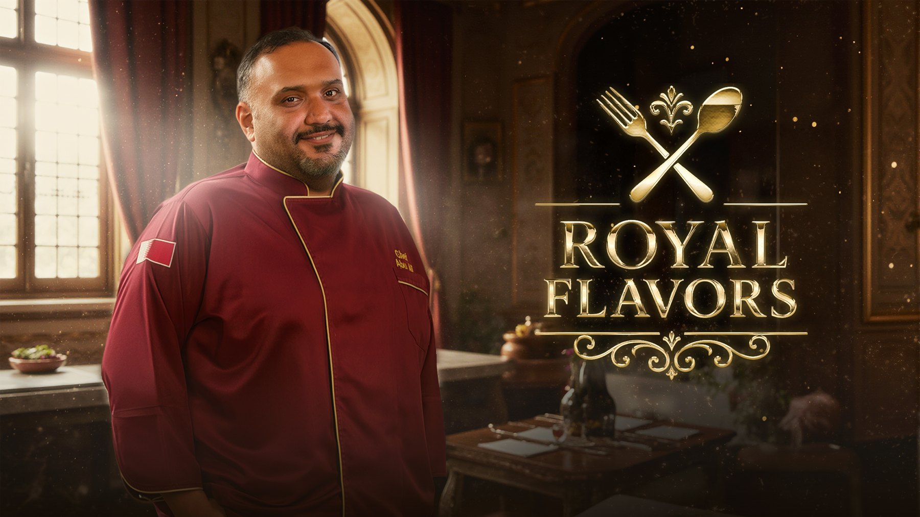
The Royale Flavors
Crossed fork and spoon under a thin gold rule. A restrained lockup for a series that needed to read as formal without turning cold, delivered with the poster set and the episode artwork.
Logo designKey art
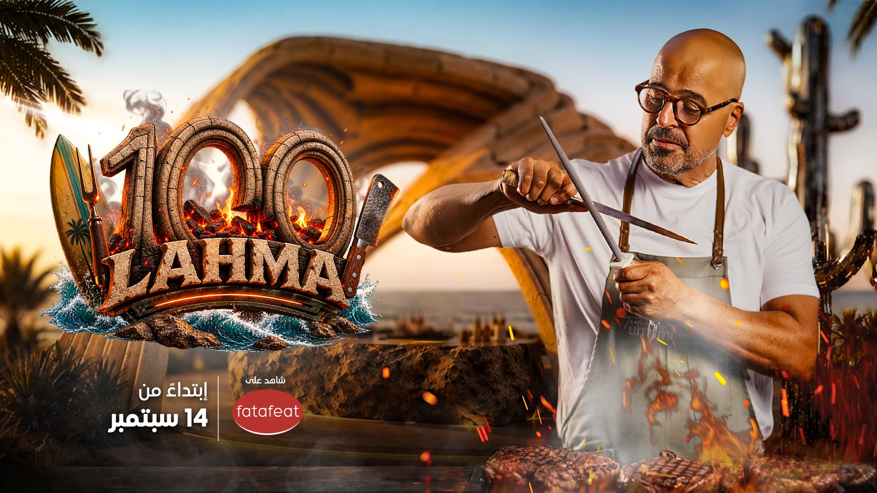
100 Lahma
Fire, a cleaver and a surfboard in the same mark. A meat series with an identity built to be loud, and a poster set that keeps it legible once the number is small.
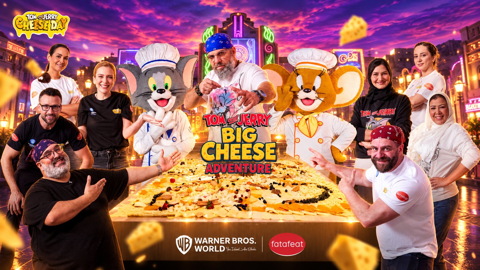
Tom and Jerry
Identity and key art
Solo
Placeholder copy. The page is built and waiting on its own words and its own artwork.